- Client: Amazon
- Year: 2018
- Categories: Creative Direction, UX Design
- Platforms: iOS and Android
- Produced while working at Mobiquity

Designing the re:Invent 2018 App
In 2017, I designed the official app for re:Invent 2017, the flagship conference for Amazon Web Services (AWS) held annually in Las Vegas. Over 50,000 people used the app as their event companion at the conference in 2017. See the 2017 case study here.
In 2018, I took on the role of Creative Director and was tasked with directing a team in evaluating and updating designs for the 2018 app based on top learnings from 2017. Feedback was gathered from App Store customer reviews and app analytics, as well as from speaking to many attendees during the conference. The top three learnings were:
(1) Due to an API limitation, the Seat Reservation feature was missing a data point, which proved to be an essential need for customers’ ability to make an informed decision;
(2) Offering a Transportation feature to assist customers in navigating between venues was a ‘must-have’ for 2018;
(3) The UX architecture and organization of content worked for 2017, but would not scale effectively as we added valuable features down the road.
My goals were to continue to learn and address user frustrations and to evolve and improve the holistic conference experience for the customer. Keep scrolling down as I describe some of the stages involved in meeting these goals.
Roadmap Planning
First up, I moderated an all-day Roadmap Planning Workshop with our client, where we worked together to prioritize enhancements and additional features for 2018, using customer feedback and learnings from 2017 as our primary guide.
Redesigning the Homescreen
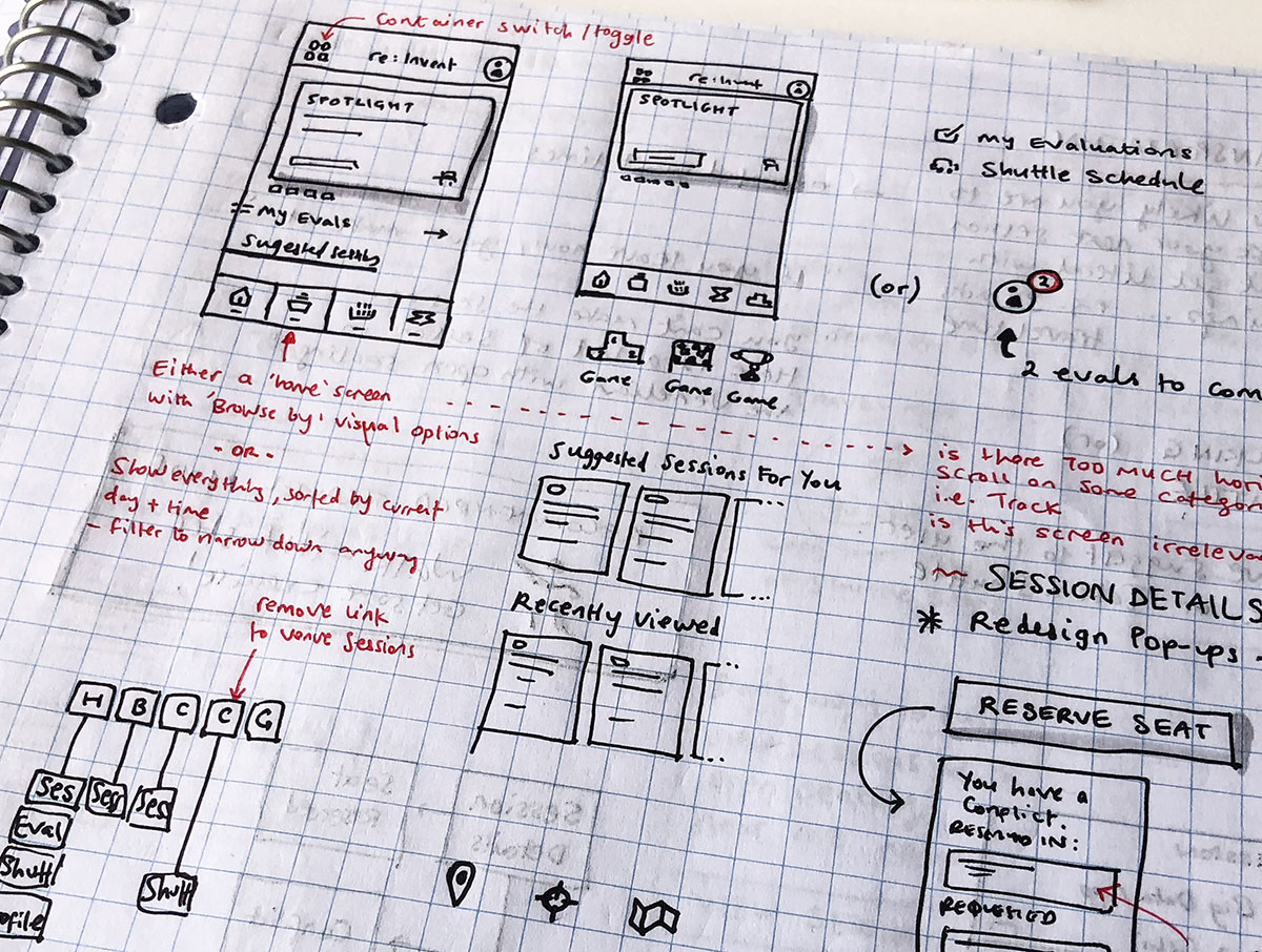
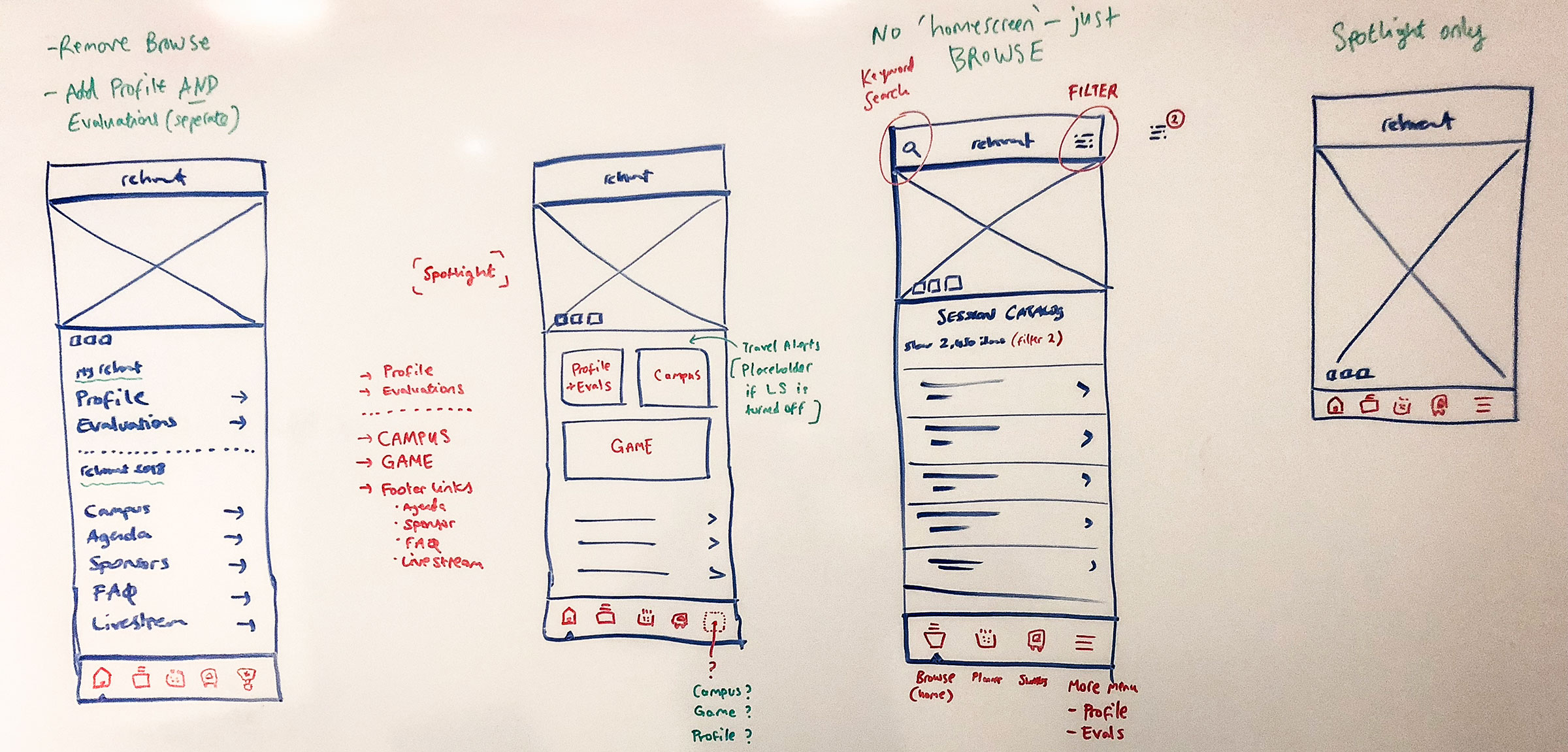
The client re-structured the session catalog content in 2018 so it was no longer grouped by venue. This decision affected architecture decisions we had collectively made in 2017. We were also expanded our feature-set offering in 2018. For these two reasons, we needed to re-evaluate the app architecture, as well as the general design of the home screen. I presented the wireframes below to the client to illustrate how I was tackling the problem, and to ultimately sell the idea of a ‘home’ screen transformed into a ‘Spotlight’ feature.
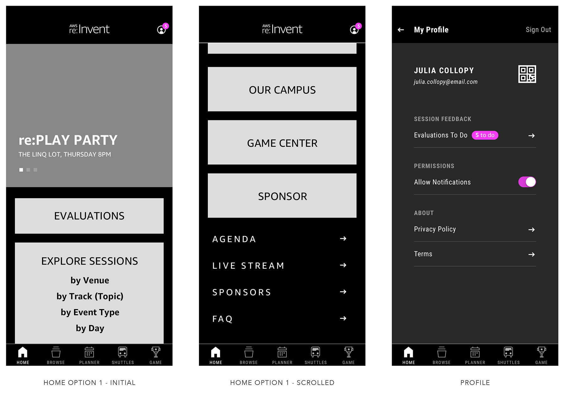
Option 1 proposed adding a navigation bar in the footer, and looked at ways of increasing visibility to the evaluation tasks users needed to complete (button in-stream content; or button anchored to top; or moving profile icon and adding badge icon to signify action required)
However, this approach impacted functionality of the “Explore Sessions” section, and would require the full Session Catalog to have location filters predefined. So I started challenging assumptions, and asked the team…
Does the “Explore Sessions” section on the home screen still make sense? … and what is the impact to the home screen if we remove it?
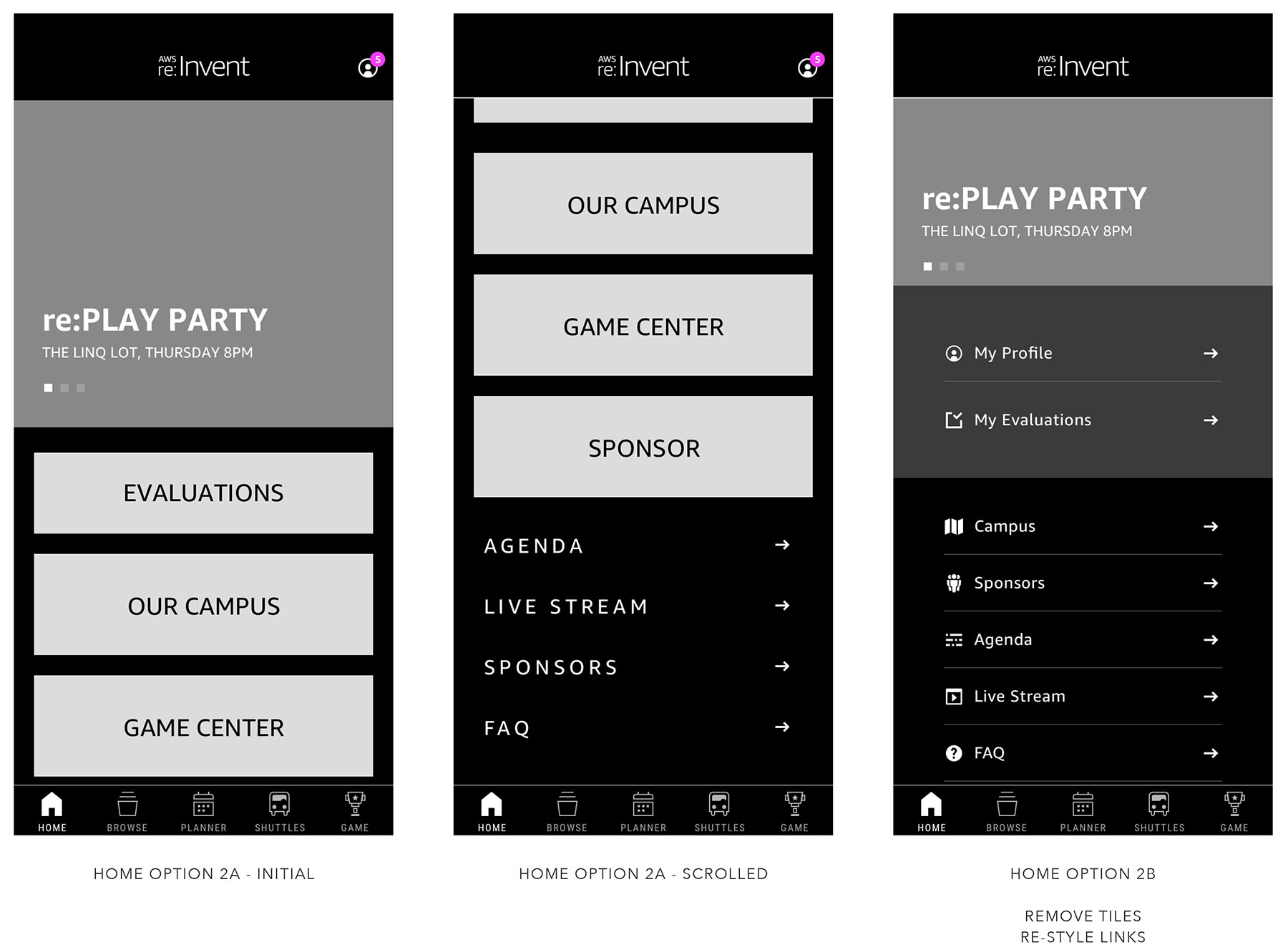
Option 2 looked at removing the “Explore Sessions” section, but the home screen was left feeling a bit empty… I needed to consider an alternative architecture for the additional content, and so I asked myself…
What if the home screen wasn’t defined as a home screen? … and HOME becomes SPOTLIGHT
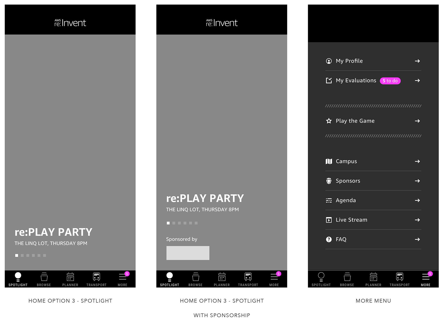
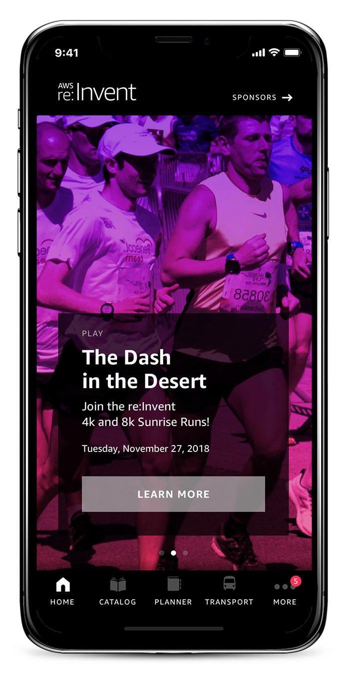
Option 3 proposed repurposing the Home screen into a visually impactful, “Spotlight” landing page, where the team could highlight key events and not-to-be missed sessions. In addition, secondary content, which took up home screen space in 2017’s app, would be moved to the overflow menu in the new Tab Bar, enabling the 3 primary use-cases of the app (browse sessions, my planner, transportation) to gain greater prominence.
Updating the Personal Planner
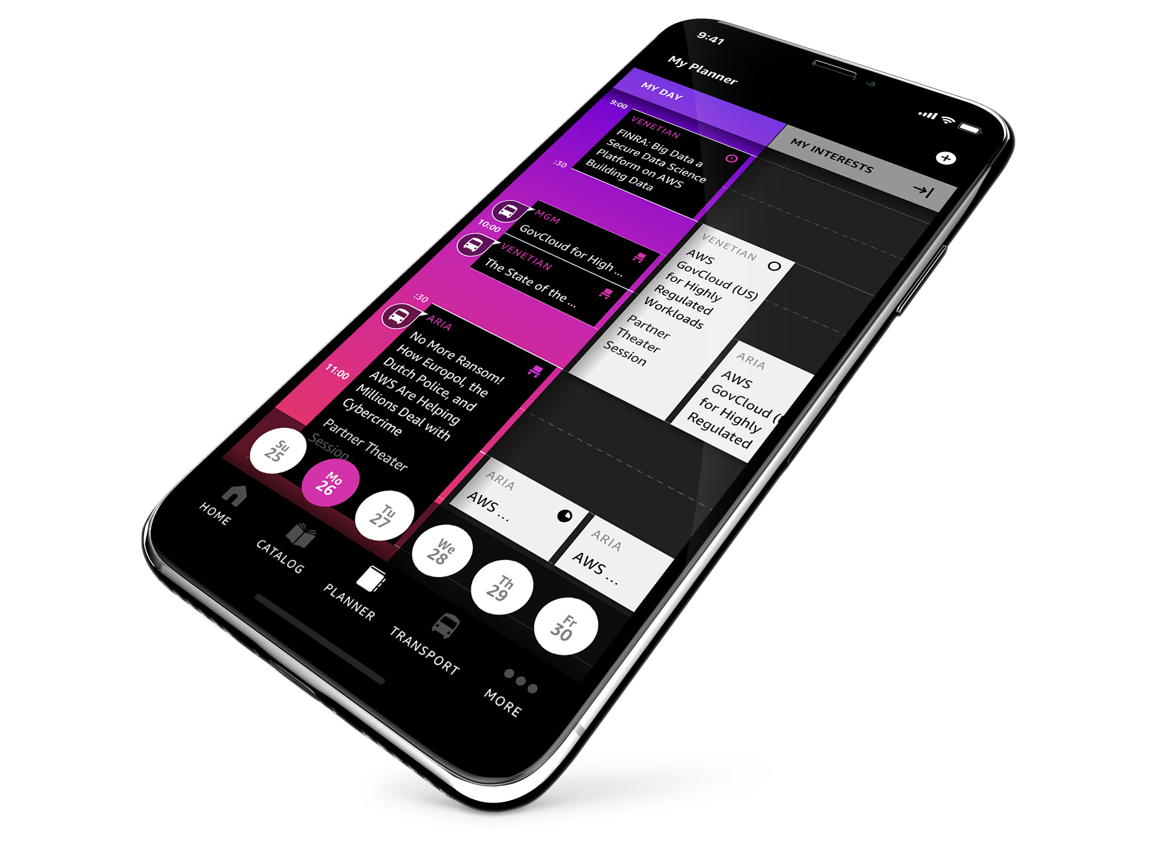
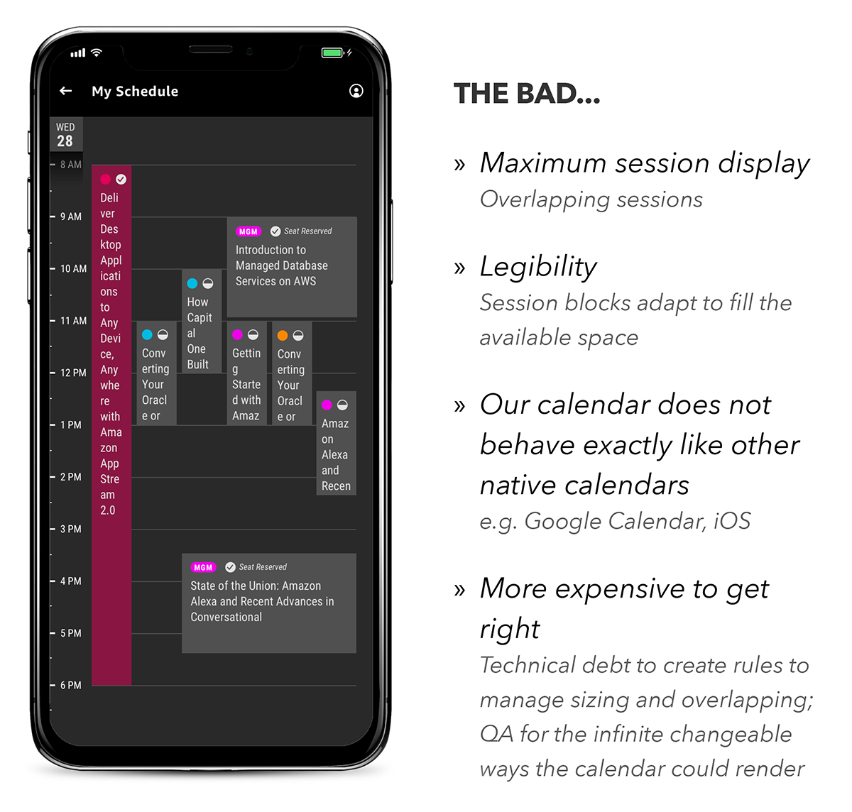
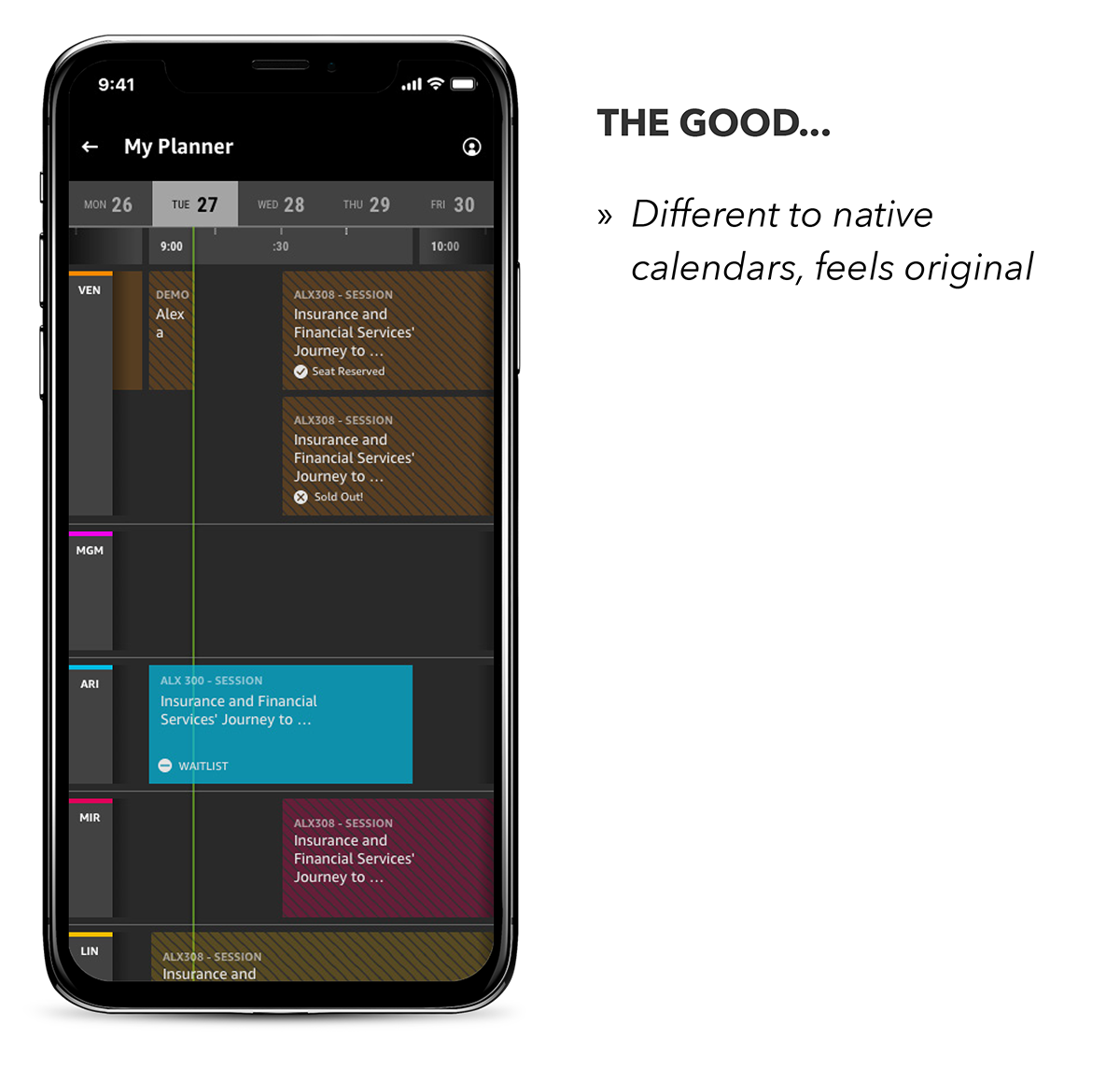
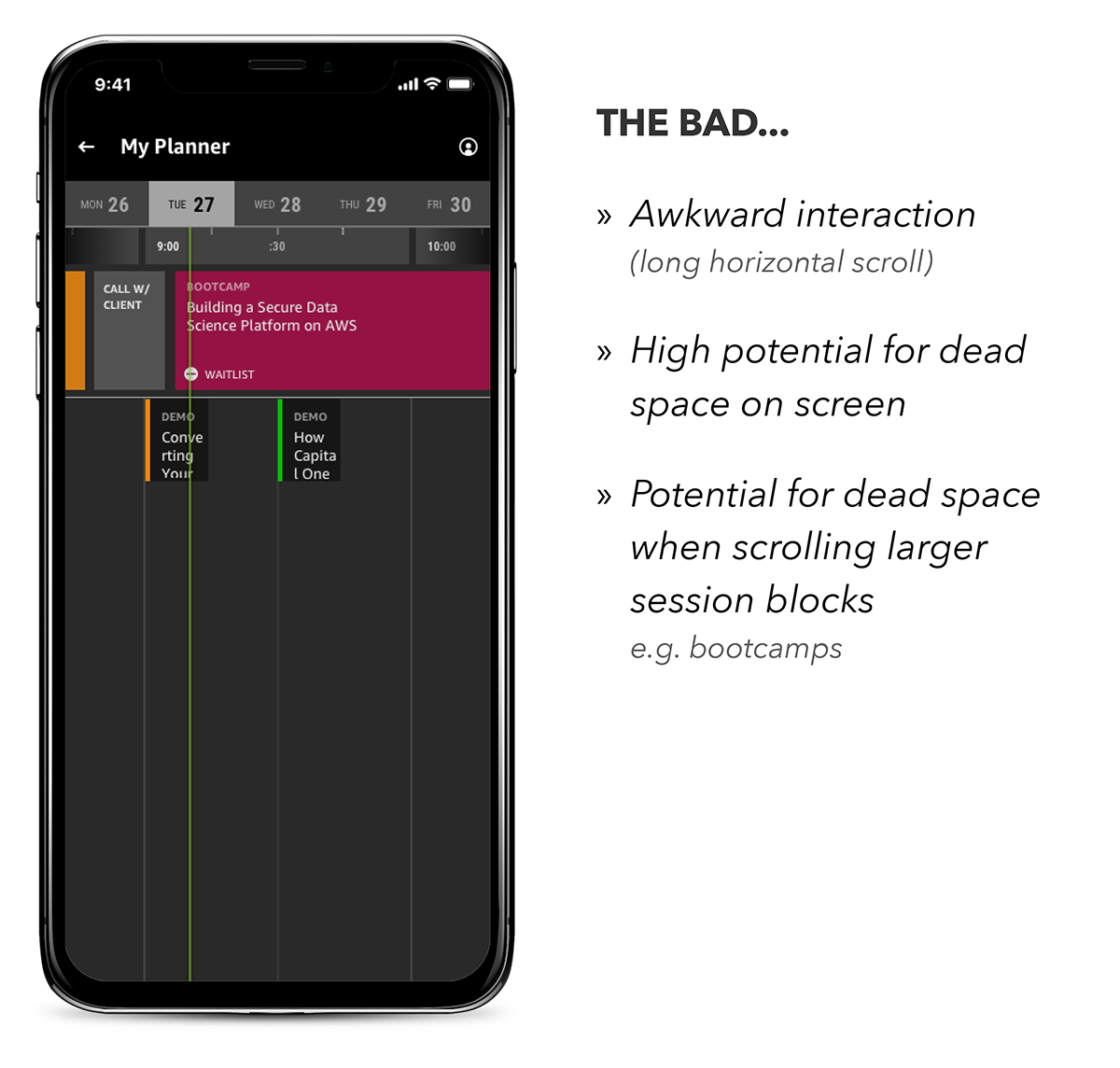
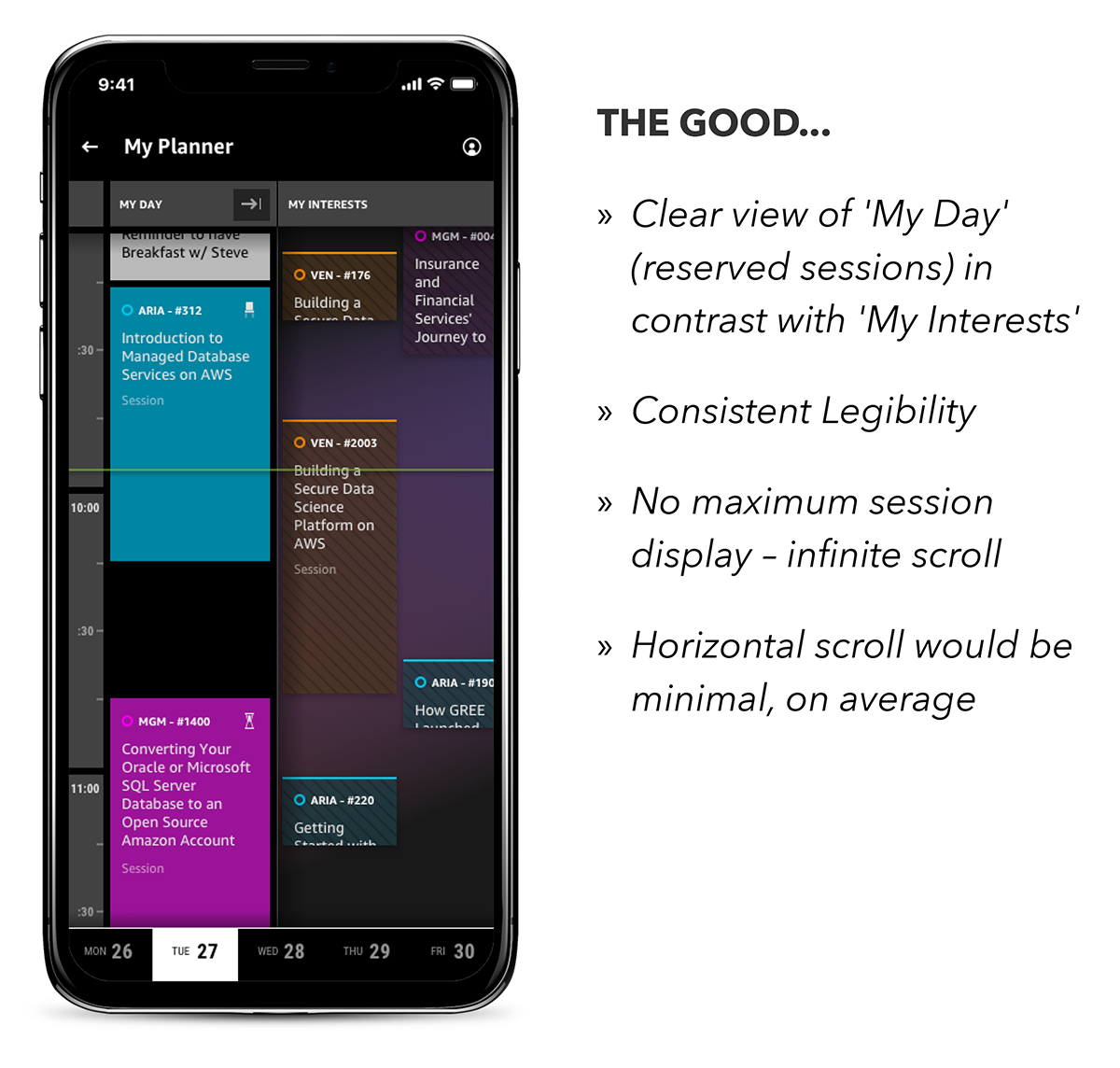
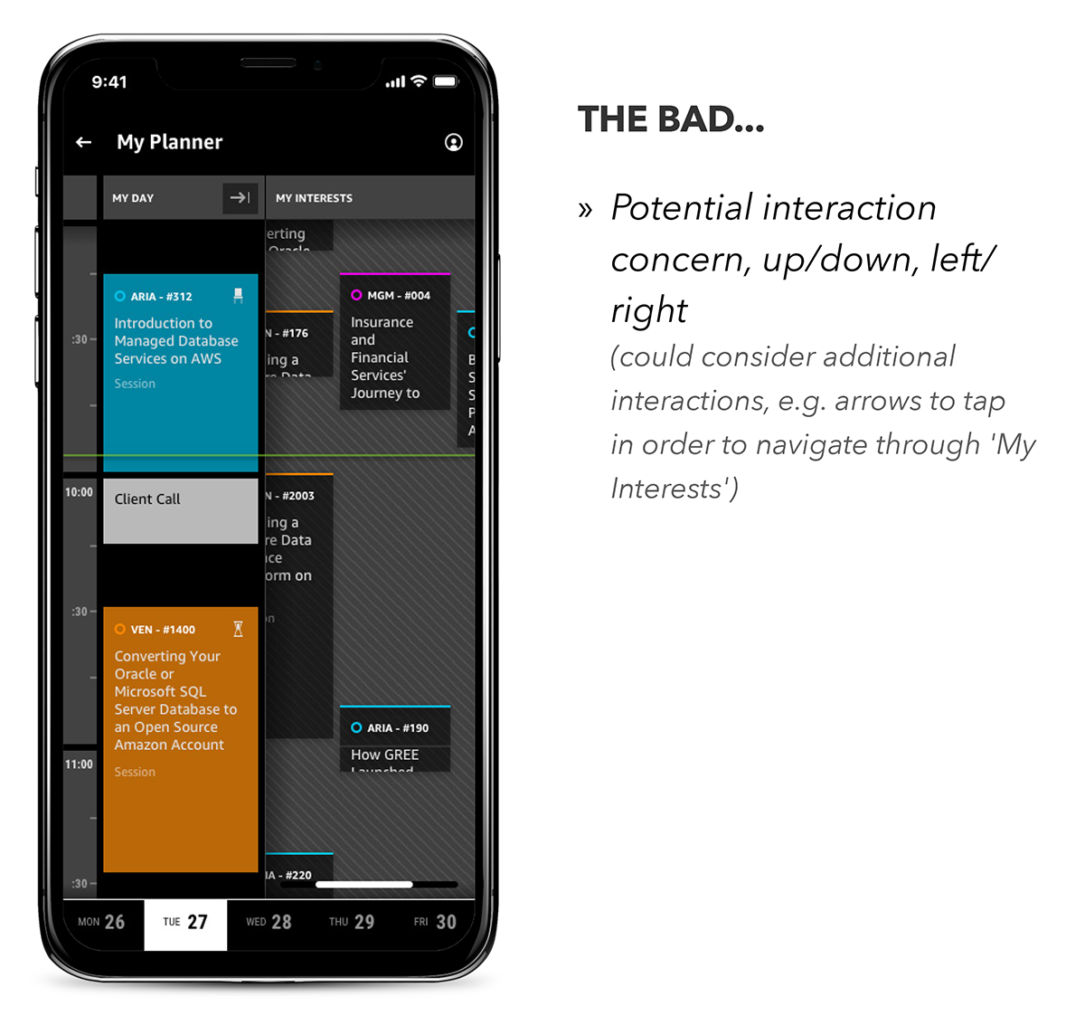
We updated the ‘list-view’ planner from 2017 to a ‘real-time’ planner in 2018. I explored pros and cons, weighing up user value and technical feasibility, for different concepts that sized the sessions in the UI proportionally to their duration and that showed booked sessions juxtaposed with tentative sessions, so that double-booking conflicts would be clear to the user.
Exploration 1 – Liquid Width
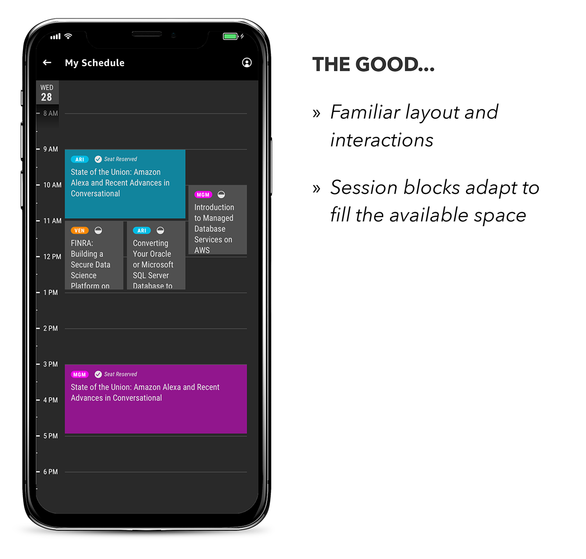
Exploration 2 – TV Guide
Exploration 3 – Freeze Left
Reserve Seat Status
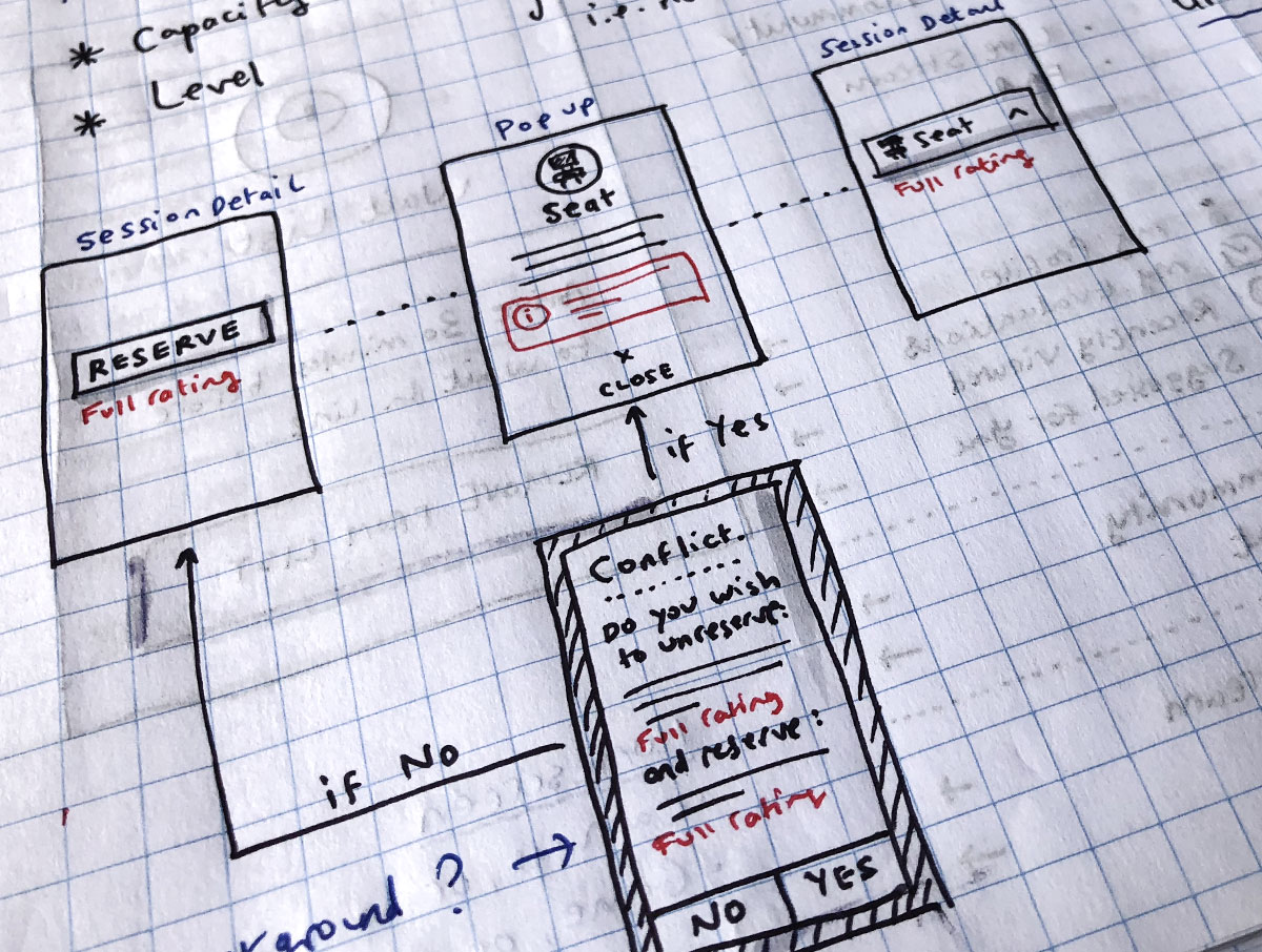
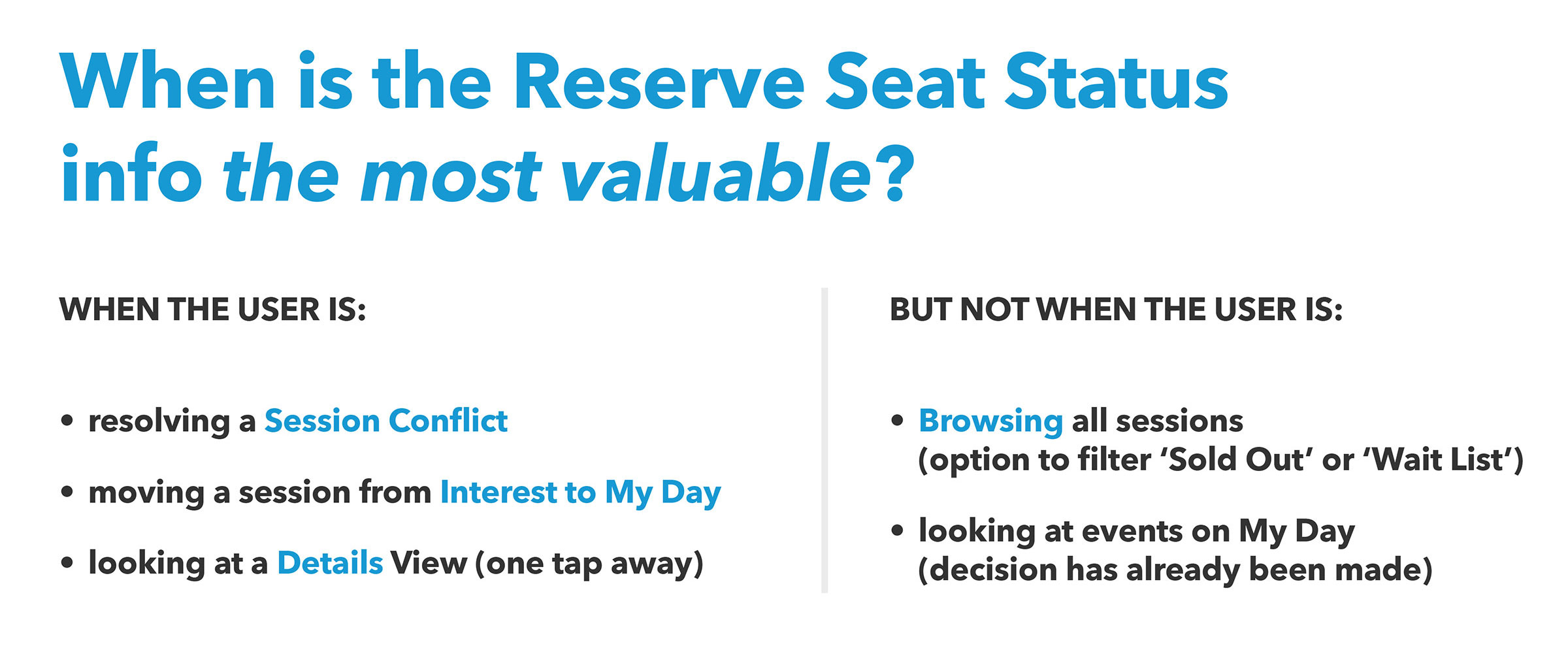
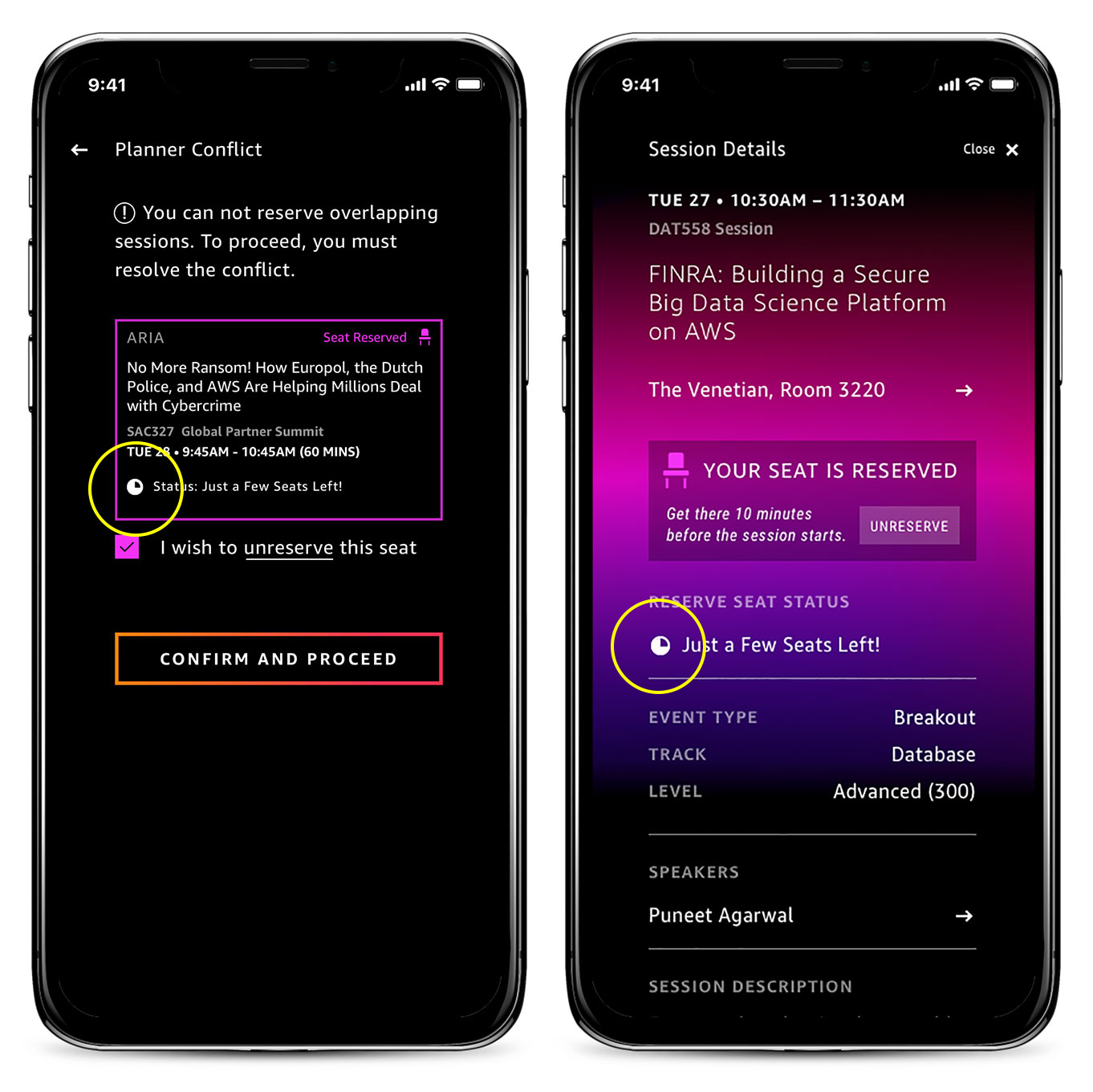
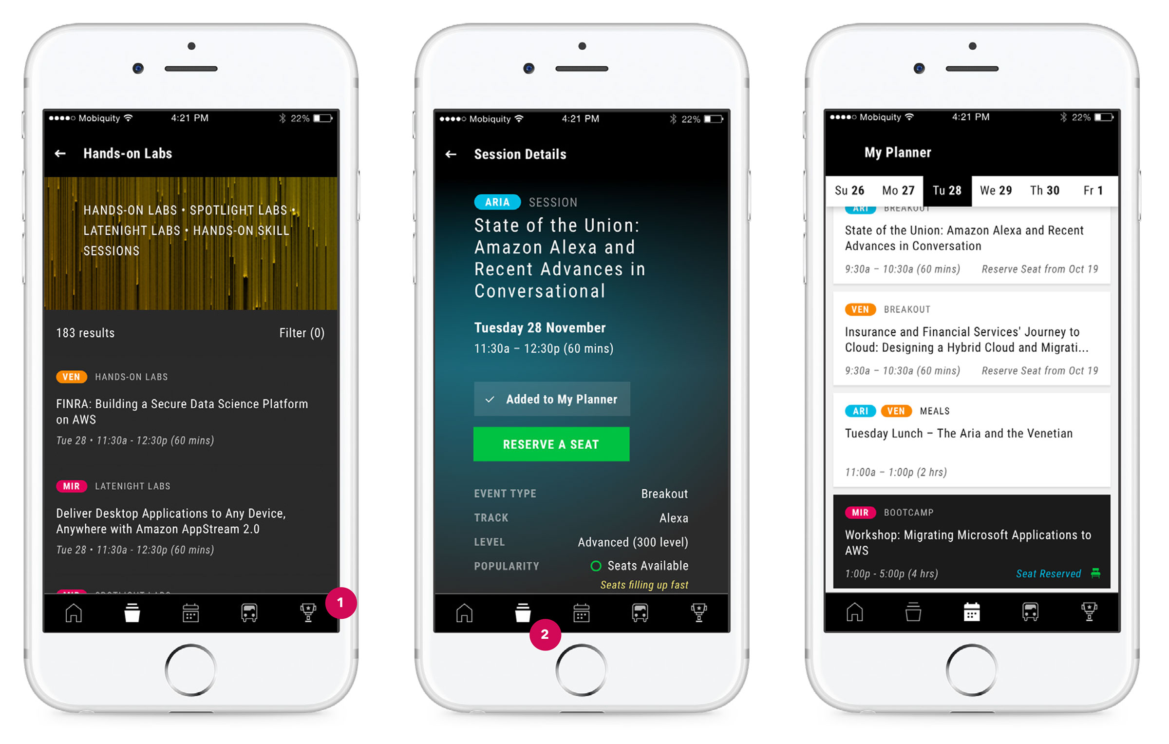
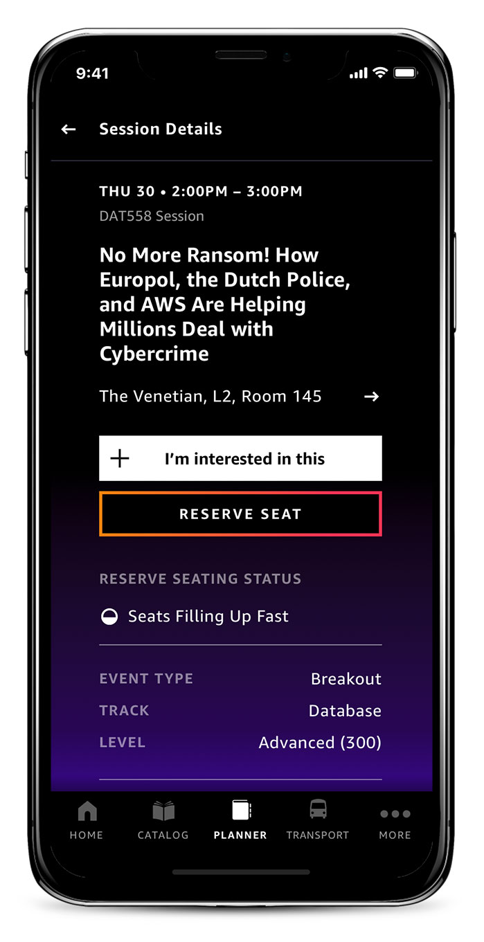
The re:Invent Seat Reservation business model does not allow for ‘double-bookings’. So if a customer has a seat at one session, and is thinking of swapping it out for a seat at another session held at the same, the Reserve Seat Status (i.e. how many seats are left) is a crucial data point in making this decision. Unfortunately, this data point was missing in 2017 due to an API limitation from the event management company. So the first step to addressing this in 2018 was convincing our partner company to update their API so that we could surface this information to the customer. The next important question was when and where to show the Reserve Seat Status in the app. The UI was already packed with icons and information, so I knew it would be important not add to the user’s cognitive load, and to only show this information when it was contextually relevant.
Contextual Information …
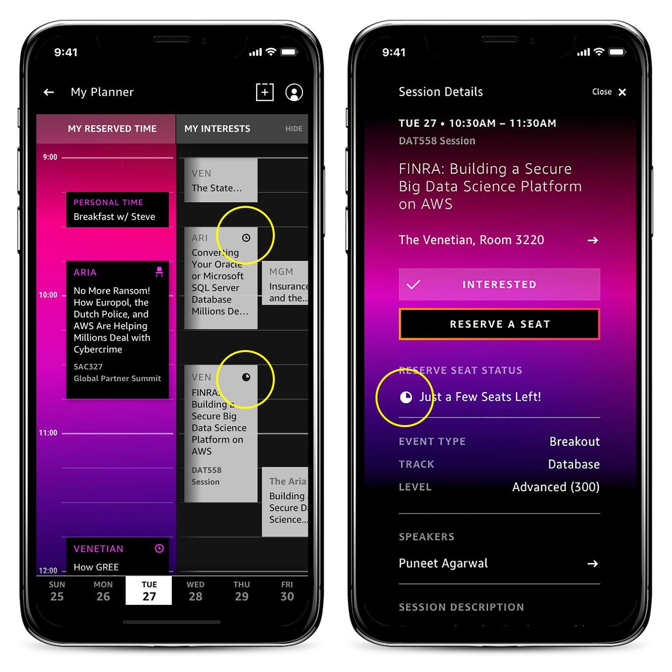
… for informed decisions
Helping Attendees Get Around
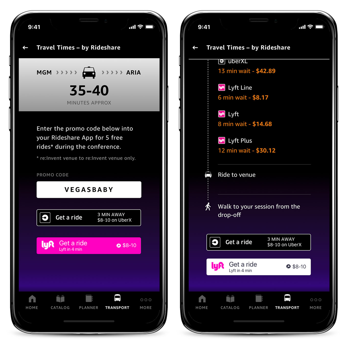
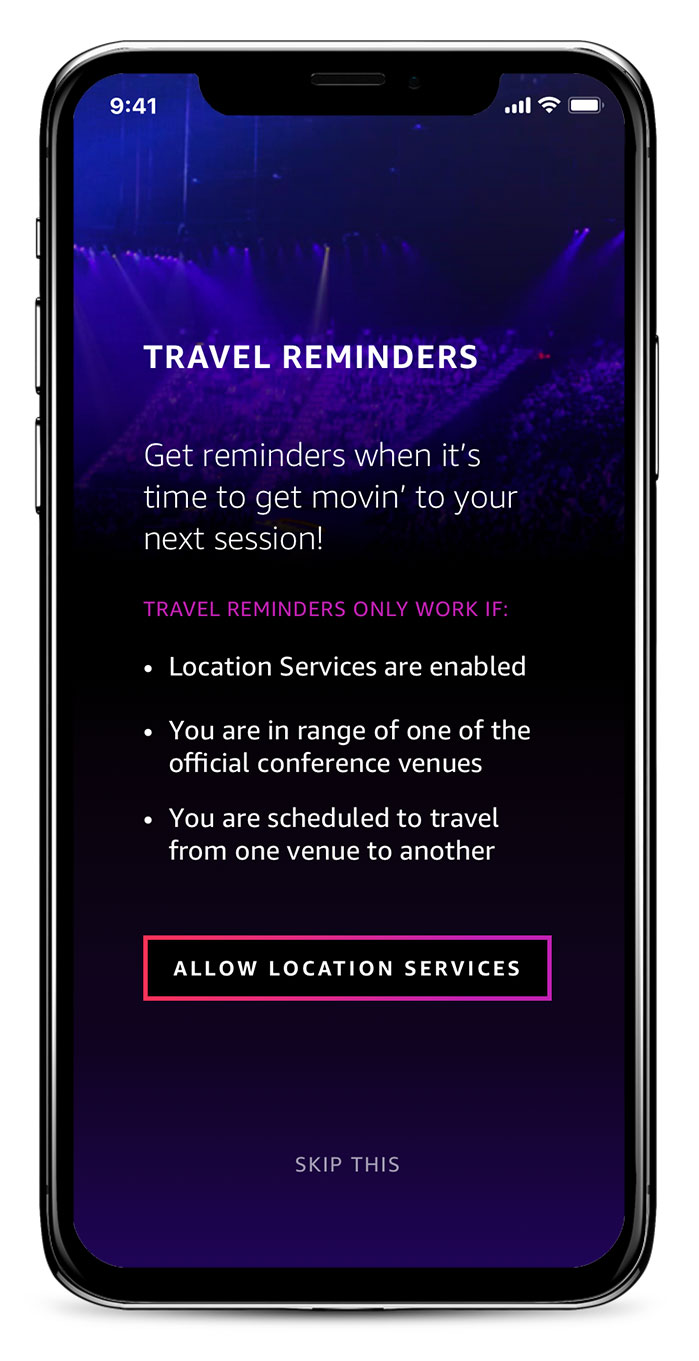
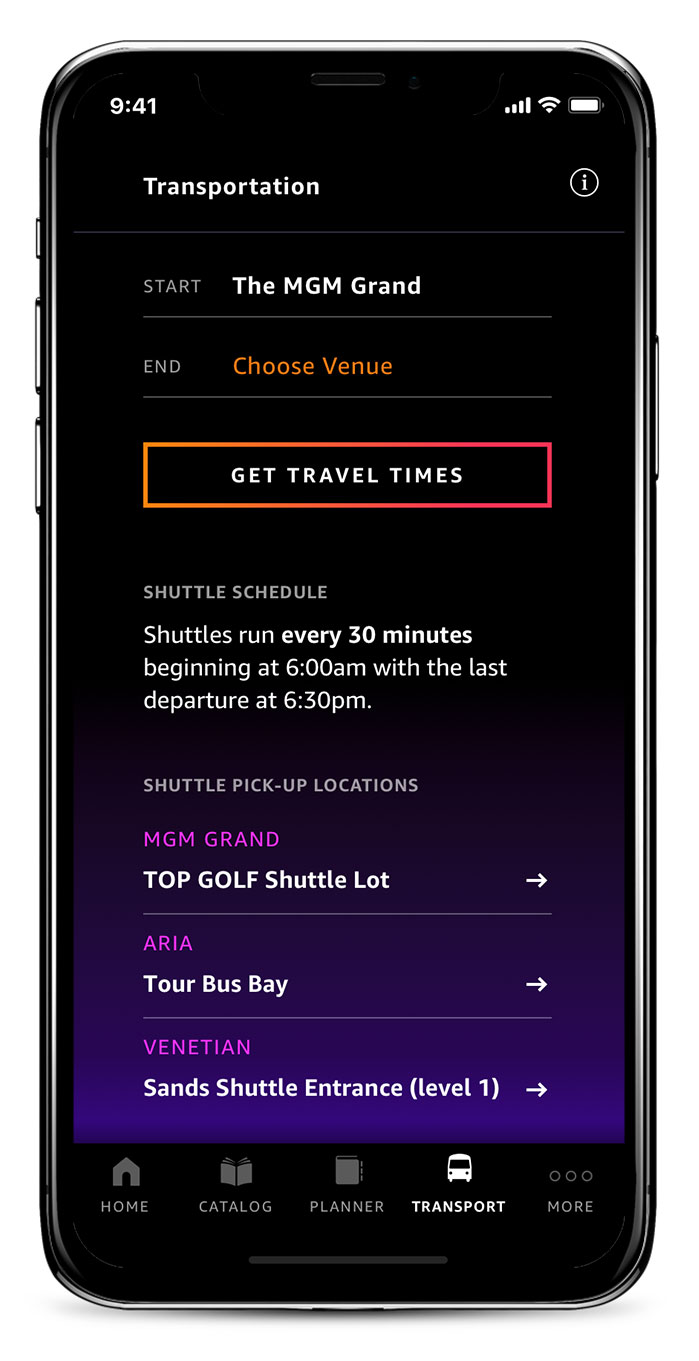
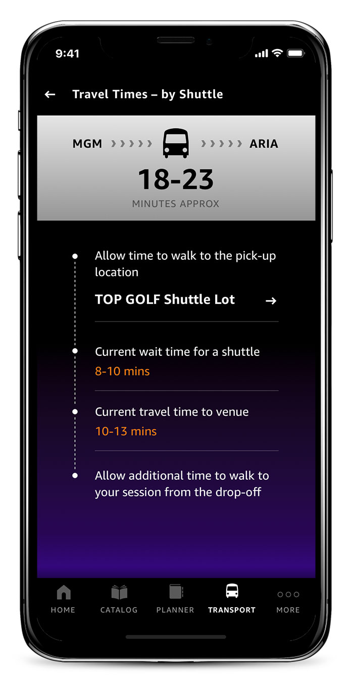
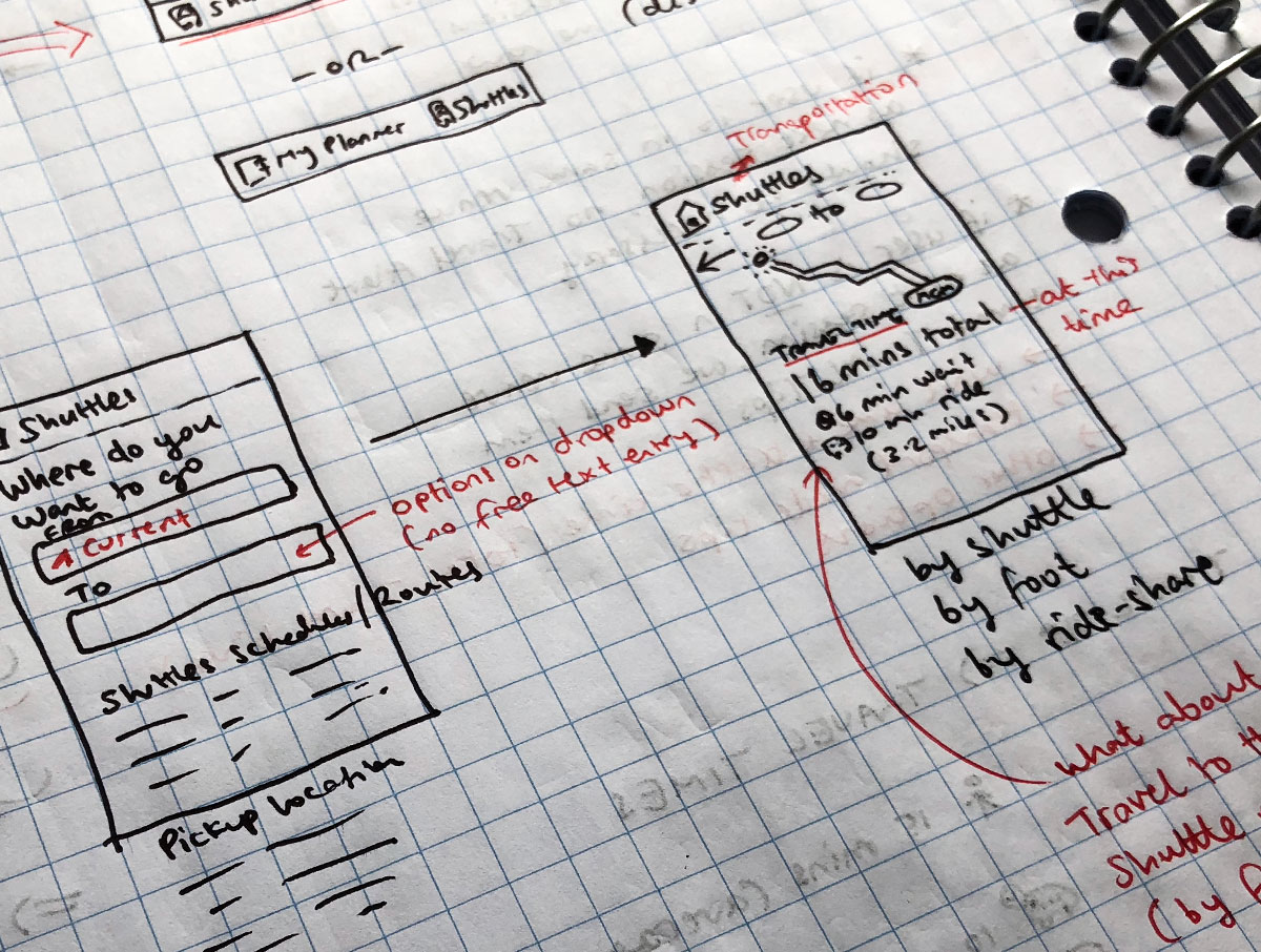
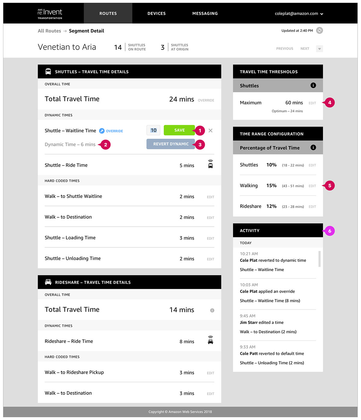
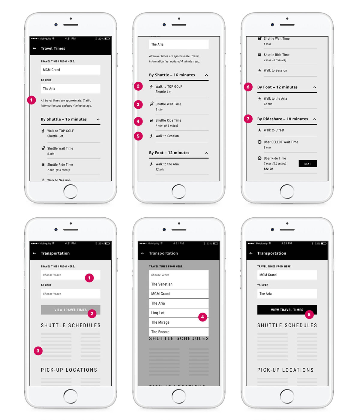
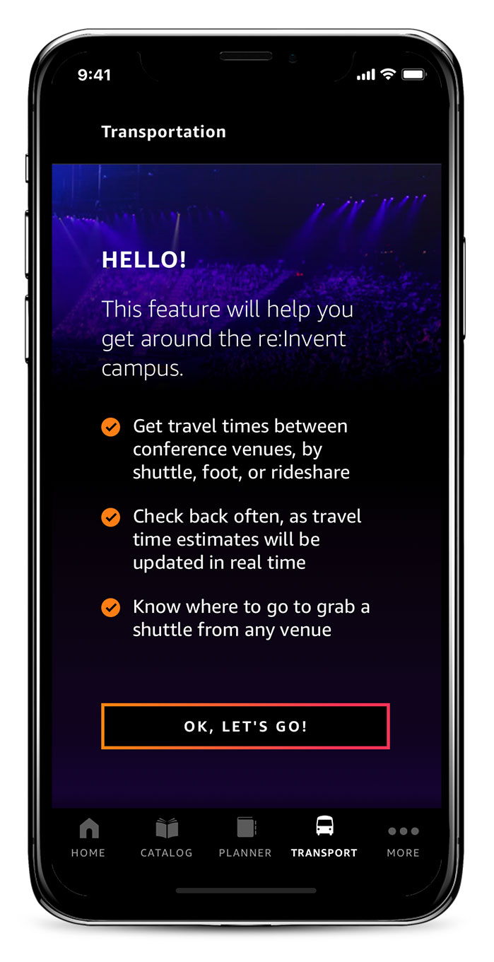
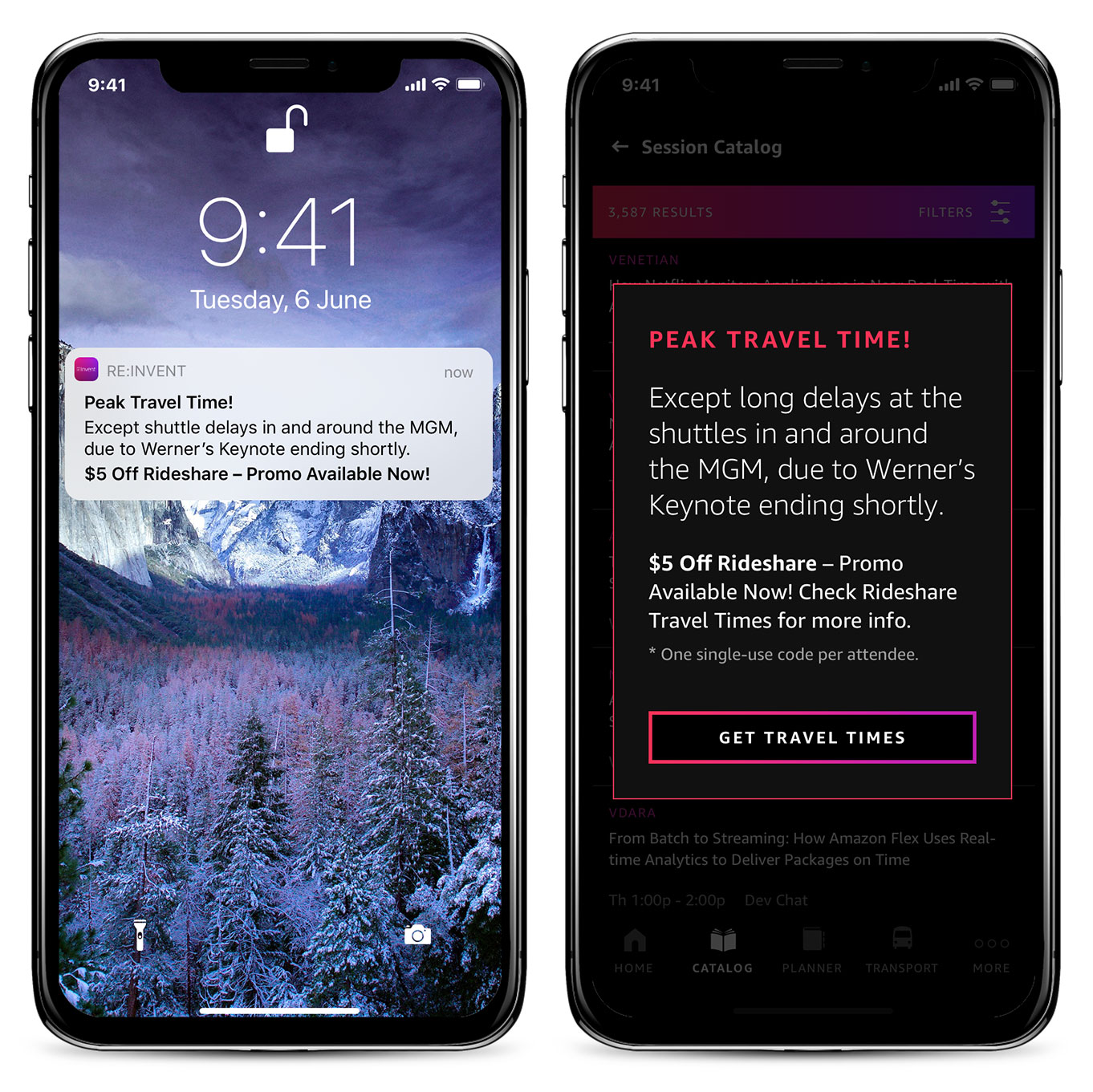
Moving from venue to venue was a huge frustration for customers in 2017. Even though there was a shuttle service on campus, there was no integration with the mobile app and limited awareness. 2018 would change that. We designed and developed a transportation feature showing venue to venue times on demand, whether traveling by campus shuttle, taxi or on foot. Live updates during peak travel times and travel reminders significantly increased value for the customer. We also built an administration panel for the client to monitor and re-route shuttles as necessary and manually over-ride travel times in response to crowd surging. The result was a much smoother travel experience in 2018 for the thousands of attendees, with positive feedback abound.
Ingress to Transportation
Option 1 – Keep Existing Nav
Allow multiple entry points to the shuttle information without changing the existing navigation.
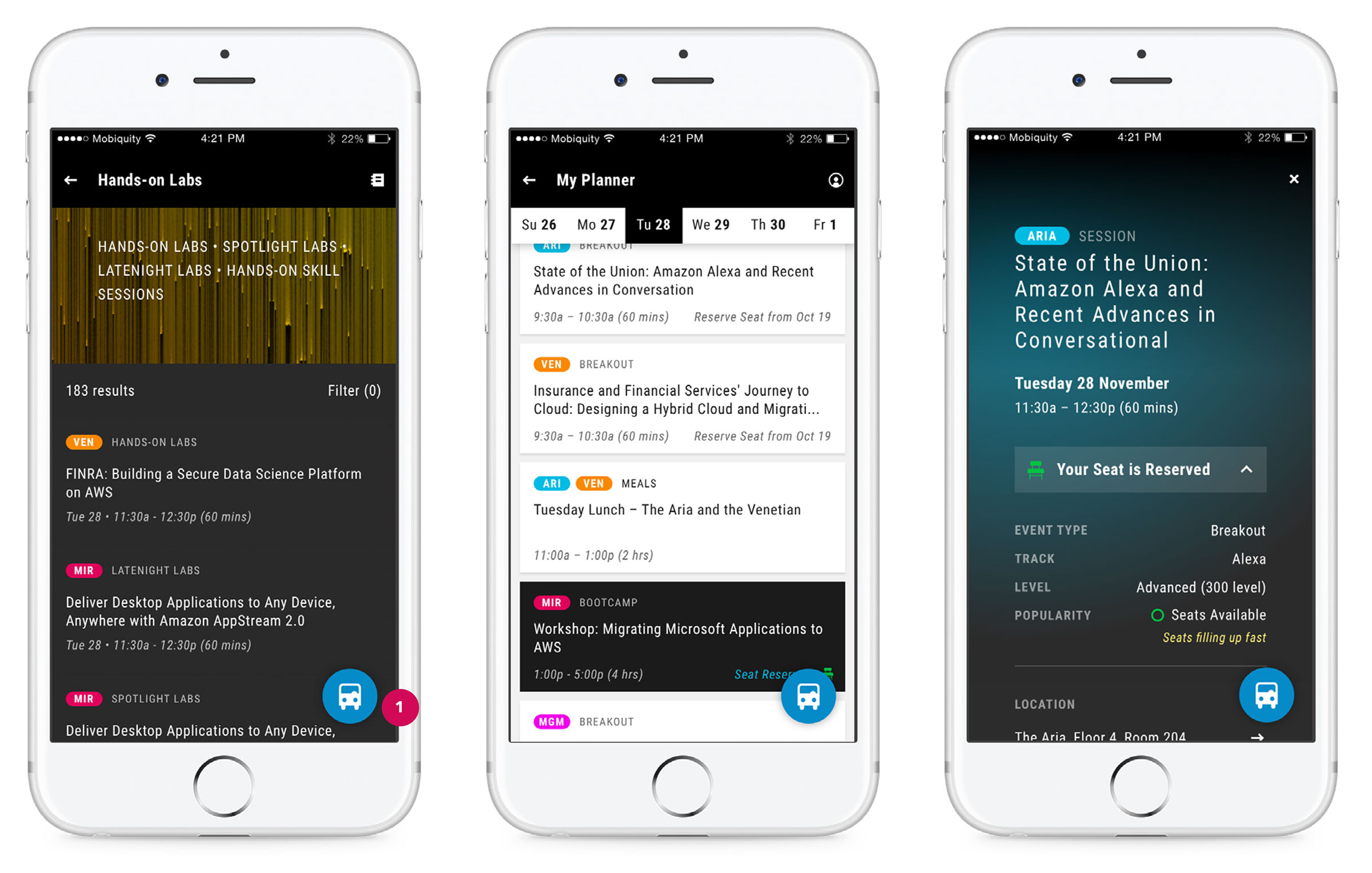
Option 2 – Tweak Existing Nav
Divide the app into 4 or 5 core areas, and allow the user subtle access to every area from every screen.
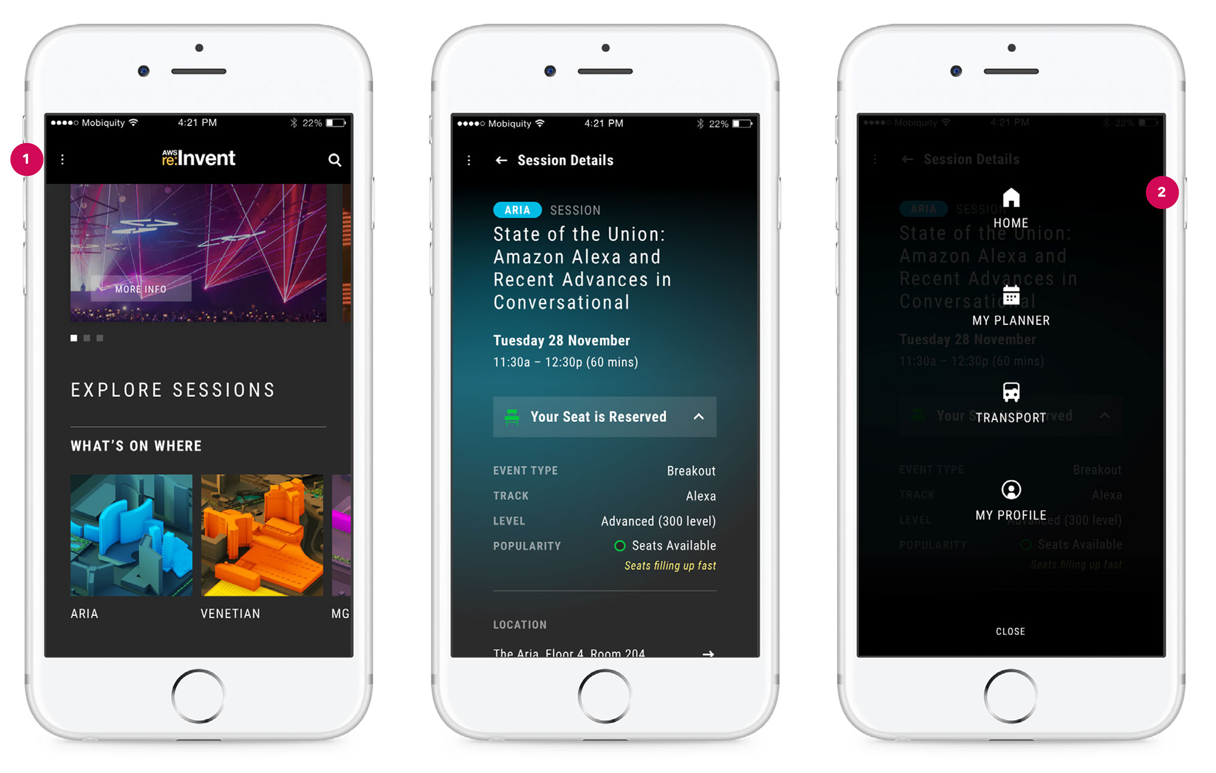
Option 3 – Nav Redesign
Change how users navigate the app; an update to the home screen would be required. (see Home Screen Re-Design section)
Final designs and the road ahead
Staying on budget and delivering on time, 2018 saw the introduction of the Transportation feature to the mobile app, improving the venue-to-venue travel experience for thousands of customers. The new UX for seat reservations also received positive reviews online and from attendees at the conference. Overall, ratings and feedback in the App Stores were higher and more positive than in 2017, validating our feature prioritization decisions and general app updates. With happy customers and a happy client, we continued work immediately after the conference, laying out the roadmap for further refinements in 2019.
Peak Travel Time Alerts
Venue to Venue Nudge
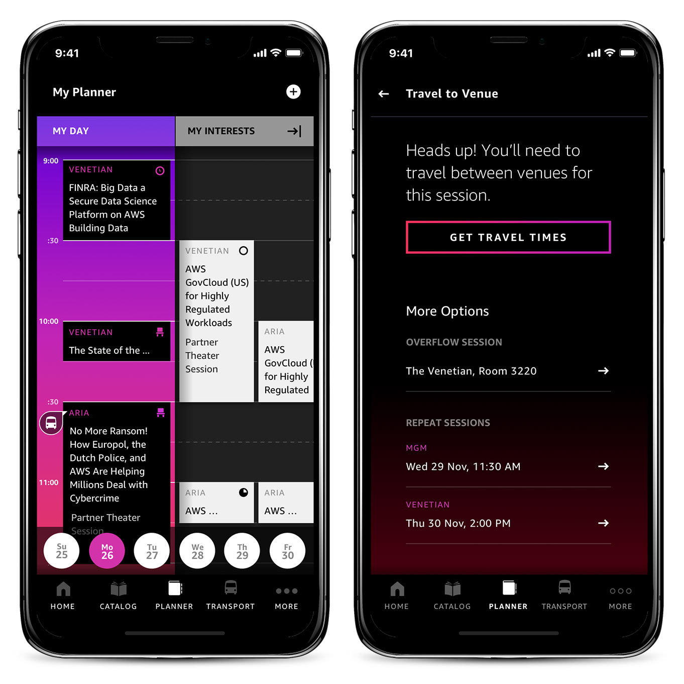
Get Travel Times
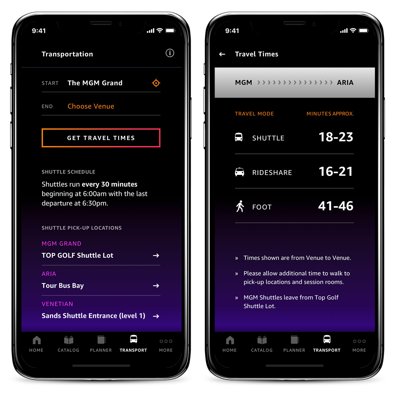
Ride Share Integration
